I have wanted Apple to make a folding iPhone since Samsung first introduced the Galaxy Fold. Not another slightly faster rectangle. Not another camera bump with a phone attached. An iPhone that actually does something different.
Now that I have spent a few weeks with the iPhone Duo, my overwhelming conclusion is rather awkward: I’m already excited about the Duo 2.
That sounds damning, and in places it absolutely is. Apple’s first foldable has some genuinely lovely hardware, a form factor I find increasingly difficult to give up, and an internal display that makes me smile. It also removes features I use constantly, makes some baffling software decisions, and leaves me wondering why a £1,999 phone feels unfinished.
This comes from a place of affection. I am sufficiently far down the Apple rabbit hole to own a personalised Apple anniversary award. But loving a company’s products does not mean politely ignoring the bits that make you want to shout into your whiskey.
Quick Summary
- The Duo’s missing Face ID, Action button, and telephoto camera introduce frustrating everyday compromises.
- Compact proportions and a titanium finish make the hardware genuinely appealing to carry and hold.
- Poor app scaling and widescreen video limitations weaken the benefits of the larger internal display.
- The folding OLED remains the main attraction, but reported screen failures raise serious durability concerns.
The Missing iPhone Features Matter More Than I Expected
The biggest problem with the iPhone Duo is not necessarily what Apple has added. It is what Apple has taken away.
Folding functionality is a substantial addition, obviously. But it comes at the expense of three familiar features that have become part of how I use an iPhone: Face ID, the Action button, and a telephoto camera.
Touch ID feels like a step backwards here
Face ID has been on iPhones since 2017, and I had completely taken it for granted. Pull the phone out, swipe up, get on with life. There is so little conscious effort involved that you stop thinking about authentication altogether.
The Duo replaces it with Touch ID on the side of the phone.
I would be less bothered if the fingerprint reader were beneath the display, or somewhere more naturally accessible. Instead, its position and the width of the phone make unlocking feel fiddly. I am left-handed and keep my phone in my left pocket, which may contribute, but the adjustment has been surprisingly jarring.
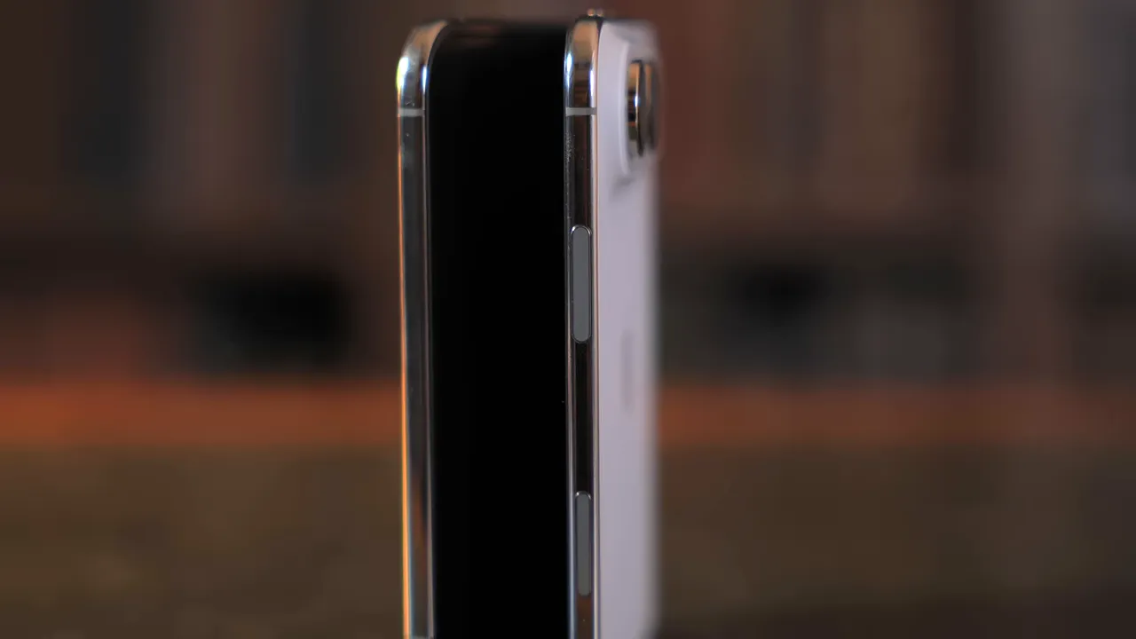
In my use, the reader fails to recognise my finger often enough to become irritating. It feels as though roughly half my attempts need more attention than they should. That is not a controlled success-rate test, but it is how intrusive the experience has become.
Then there is the Rest Finger to Open setting. In principle, it gets closer to the seamlessness of Face ID by taking you to the Home Screen when your registered finger rests on the sensor.
In practice, I had to turn it off.
Simply holding the phone could unlock it when I had no intention of using it. My palm and fingers would then start prodding an active touchscreen, producing exactly the sort of chaos you would expect. Authentication should not feel like a negotiation between convenience and accidental international dialling.
I actually used the Action button
The missing Action button will divide people. Some barely touch it. I used mine all the time.
I built a shortcut that checks the local weather and temperature, then prepares my Tesla’s climate system before I get in:
- If it is cold, it starts warming the car.
- If it is hot, it switches on the air conditioning.
- If the temperature is below freezing, it enables defrosting.
One press, and the car starts getting itself ready for the conditions. Because the button is physical, I could trigger it by feel without taking my phone out of my pocket.
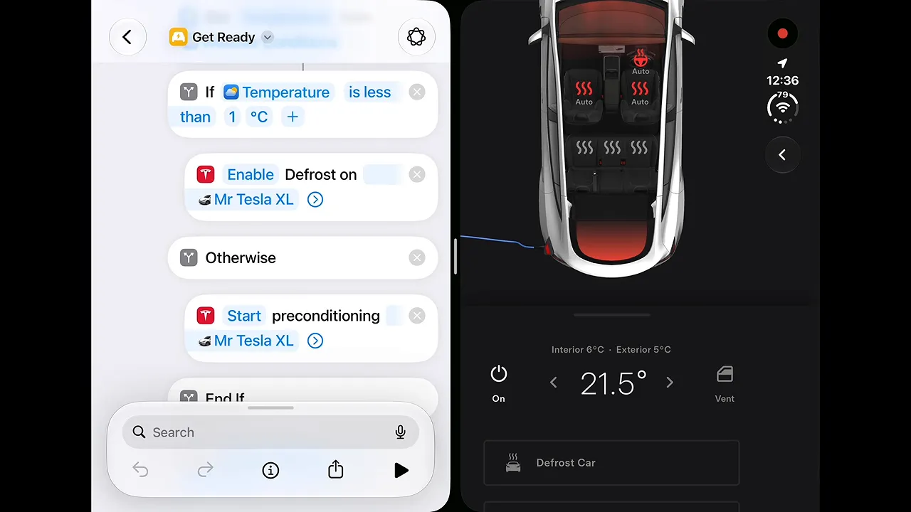
The automation still exists on the Duo, but I have had to move it to a Home Screen shortcut. Now I need to take the phone out and interact with the screen. The task is still possible; the effortless bit has disappeared.
That distinction matters. A feature does not have to be essential to be valuable. Anyone interested in building similar automations can start with Apple’s Shortcuts user guide, but software cannot replace the tactile convenience of a button that is no longer there.
The telephoto camera is the omission that really annoys me
The Duo has two rear cameras: a standard camera and an ultra-wide. There is no telephoto, despite that lens being part of Apple’s premium iPhone range since 2019.
Of all the omissions, this is the one that gets me properly grumpy.
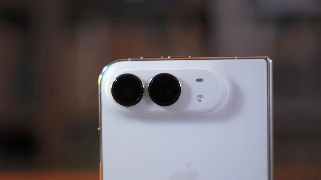
I use the telephoto for portraits, video, and bringing distant or small subjects closer in the frame. For my photography, it is far more useful than the ultra-wide.
Perhaps other people genuinely spend more time using the ultra-wide. Fair enough. But if Apple had to choose two cameras, a standard and a telephoto would have made considerably more sense to me.
A premium foldable should not automatically mean giving up the premium camera feature I use most.
Why This Feels Like a First-Generation Product by Design
Put those omissions together and I struggle not to become cynical.
My suspicion is that Apple is leaving itself a conveniently obvious upgrade path. Add Face ID and an Action button to a future Duo, then introduce a third camera further down the line. Suddenly there are several generations of straightforward marketing announcements ready to go.
That is my interpretation, not evidence of a secret roadmap. I cannot prove there is a fully equipped Duo sitting in a Cupertino vault. But the decisions make the current phone feel deliberately incomplete, and that is what I mean when I complain about planned obsolescence here: the sense that familiar functionality is being reserved to make later upgrades more tempting.
I understand that Apple is a business. It wants repeat purchases and happy shareholders. I am simply less enthusiastic about funding that strategy when this is its most expensive base phone.
The original iPad is the comparison I keep returning to
The Duo reminds me of the gap between the first iPad and the iPad 2.
The second model was thinner and lighter, lost the awkwardly bulging rear shape, gained a dual-core processor, and added both front and rear cameras. It also had a much cleverer cover system than the first generation’s rather uninspiring case.
Those changes made the iPad 2 feel like the product the original should have been.
That is the risk hanging over the Duo. I can easily imagine holding a second- or third-generation model and thinking exactly the same thing. It is not that the underlying idea is wrong. It is that the first attempt leaves so many obvious improvements on the table.
The Hardware Gets Some Important Things Right
Right. Enough grumbling for a moment, because there are parts of this phone I bloody love.
The return of titanium is one of them. I like the look and feel of polished metal on a premium phone, whether that is steel or titanium. It looks expensive and feels lovely in the hand. I was disappointed by the move back to aluminium on the iPhone 17 Pro, so this is very welcome.
The size is another success. Closed, the Duo is not far off passport-sized, and I find it comfortable both to hold and to carry.
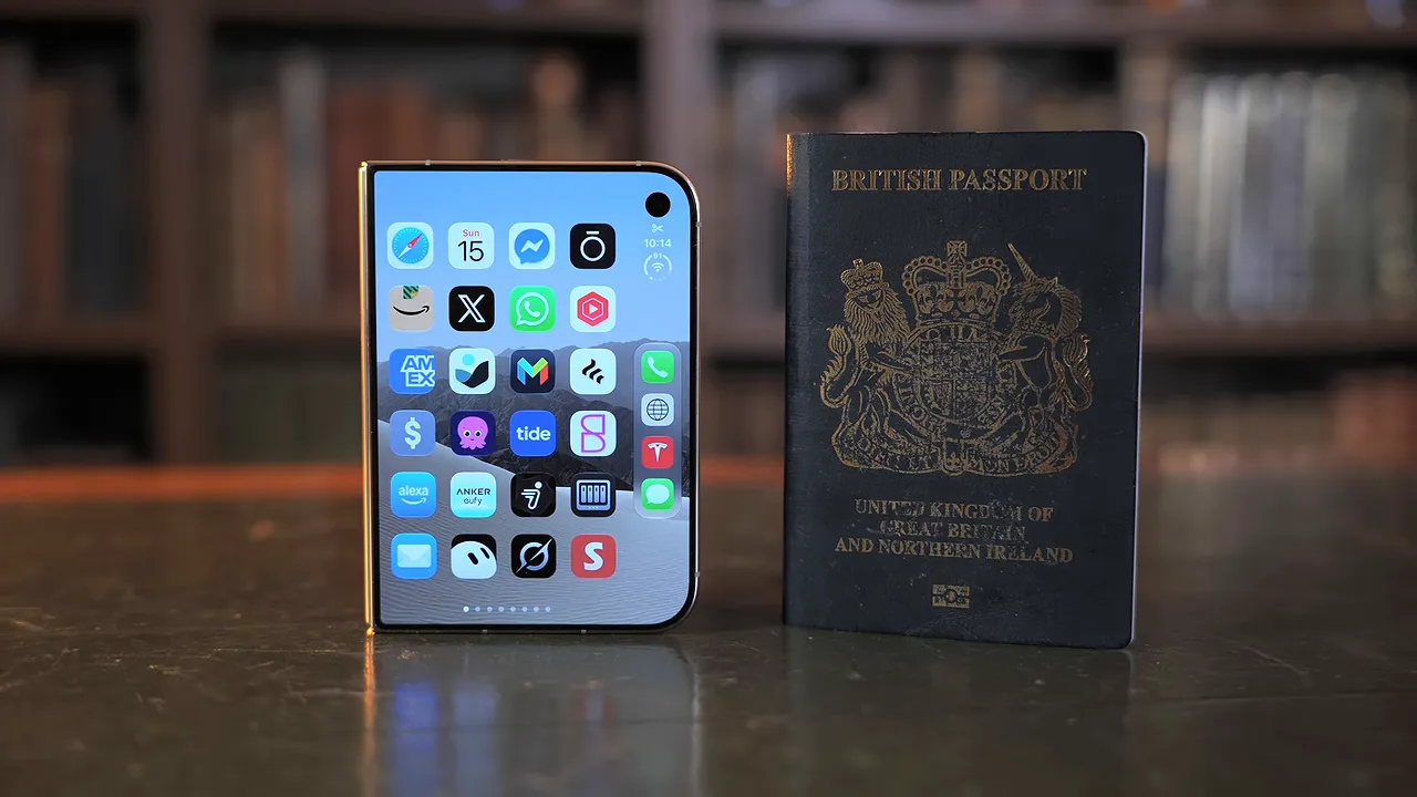
Coming from a 17 Pro Max, having something less enormous in my pocket has been a pleasure. After a week with the Duo, picking up a Pro Max again felt absurd. The familiar tall rectangle suddenly seemed approximately a metre long.
That is one of the most persuasive things about a foldable. It does not merely add a larger screen. It changes what you become accustomed to carrying.
Unfortunately, the unusual proportions also expose some rather less persuasive software decisions.
The Software Does Not Feel Polished Enough
I expected Apple to arrive late to folding phones with a particularly well-resolved software experience. Instead, app optimisation has been surprisingly poor.
Some third-party apps fail to fill the outer display properly, leaving a substantial black strip down the right-hand side. Open the same app on the internal display and the result can be even worse: a narrow phone interface marooned in a much larger screen.
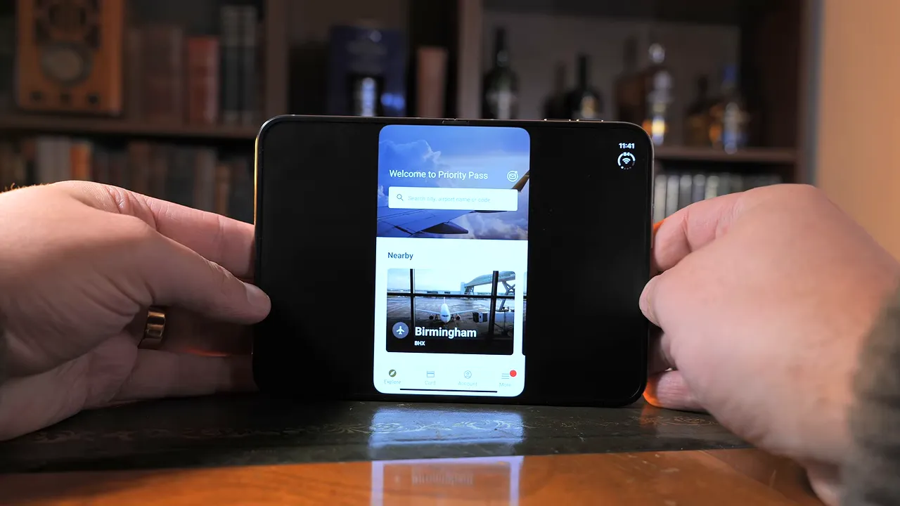
I had hoped Apple would do more to accommodate existing apps or encourage developers to prepare suitable layouts. The whole point of this hardware is the flexibility of its screens. Poor scaling undermines that immediately.
Apple’s own layouts are not immune
It would be easier to forgive third-party growing pains if Apple’s own software set a consistently excellent example. It does not.
The dock’s placement on the left of the outer display creates an arrangement that feels strangely unbalanced, with space on the right not being used effectively. I notice that wasted area on the Home Screen and in apps.
Safari is a particularly frustrating example. Why squeeze the browsing experience into a narrower portion of a screen that already has room available?
These are not the decisions I associate with a company that normally obsesses over interface polish. The result feels less like a carefully reconsidered iPhone and more like familiar software being persuaded, with varying success, to inhabit unfamiliar dimensions.
A larger display does not necessarily mean a larger film
Media is another complication. A folding phone sounds ideal for a commute: open it for a larger picture, then close it when you arrive.
But the Duo’s internal aspect ratio means that a widescreen film, shown without cropping, ends up looking almost the same size as it does on an iPhone Pro Max.
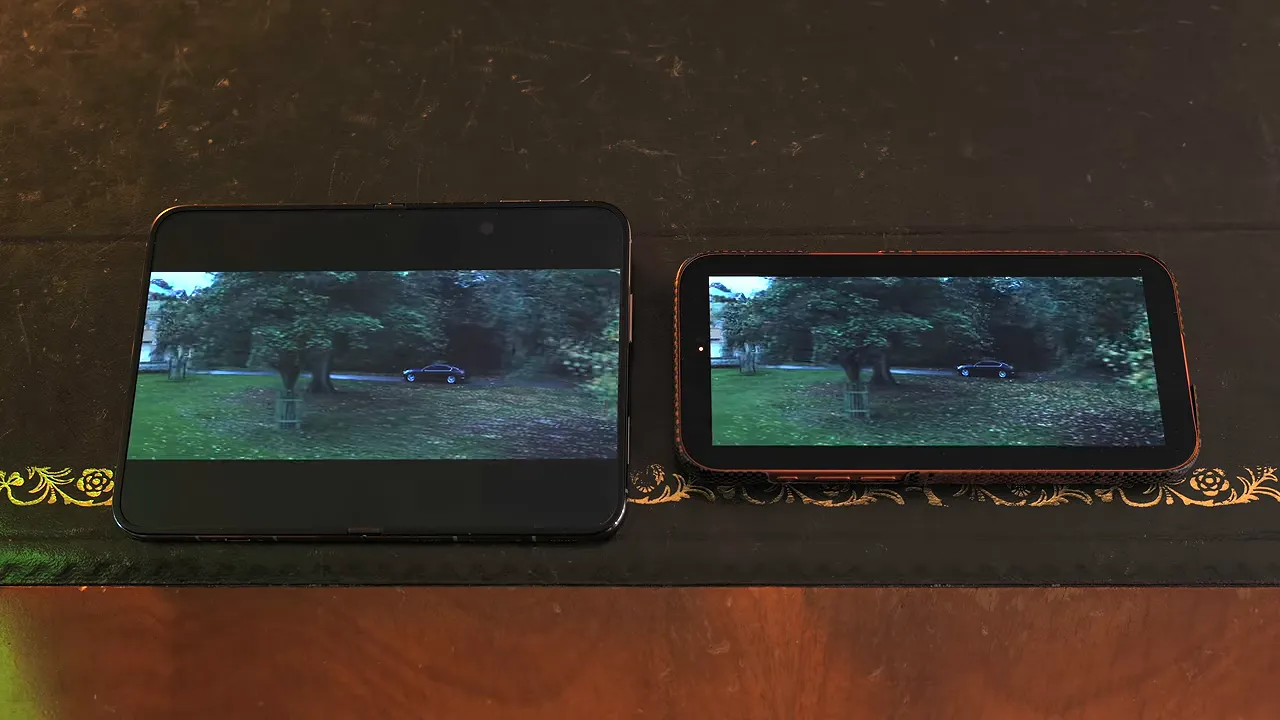
You can enlarge the picture to fill more of the Duo’s screen, but then you cut away a substantial amount of the image. On the Pro Max, filling the display costs relatively little. Here, the crop can feel like it has eaten half the film.
Screen shape matters just as much as screen diagonal. If widescreen films are your main reason for buying a foldable, do not assume the unfolded panel delivers the improvement its size suggests.
Set media aside, though, and much of the larger-screen experience is good. With properly optimised apps, it feels very much like having a small iPad available in a pocketable device. That is not a new concept, but it remains an appealing one.
The Internal Display Is the Main Attraction, With a Serious Caveat
The 7.6-inch folding OLED is the strongest reason I keep reaching for the Duo.
The under-display camera helps maintain a largely uninterrupted screen. There is a trade-off: its 1080p image quality is visibly less impressive. For what I use that camera for, however, I am happy enough to accept the reduction in exchange for a cleaner display.
The nano-texture finish is another decision I like. It helps disguise the folding seam and gives the panel an anti-glare quality that suits it well.
I have seen complaints about daylight visibility, but that has not matched my experience. I have found it perfectly usable. Personally, I hope Apple keeps this finish, although I have a nagging suspicion it may not survive into the next model. Again, that is a hunch, not a confirmed change.
In terms of how it looks and feels, this is the best internal folding display I have tried so far.
Provided, of course, that it does not break.
The reported screen failures cannot be brushed aside
There have been reports of internal displays breaking in the same position. The teardown explanation discussed around those failures suggests a possible hinge-related problem beneath the screen: a component may become stuck, leaving the panel to fold against metal that damages it.
That proposed mechanism should not be confused with a confirmed diagnosis for every failed unit. Nor do I have a reliable failure rate to attach to it.
Nevertheless, the apparent similarity between reported failures is concerning. It brings Apple’s butterfly keyboard problems to mind, which is hardly the association you want when spending this much on a phone.
How serious this becomes depends on how widespread the issue proves to be and whether the likelihood increases with use. Those are important uncertainties, not details to wave away because the screen looks lovely.
And that is the contradiction again. I genuinely enjoy this display. The combination of a compact outer screen and a larger internal panel is making me fall for the phone. But display durability is a fundamental concern, especially when the folding screen is the entire reason to buy it.
Is the iPhone Duo Worth £1,999?
The price was, oddly enough, a better surprise than I expected.
Nearly £2,000 for a mobile phone is ridiculous money. But I had anticipated a starting price closer to £2,299, so £1,999 came in meaningfully below my own gloomy prediction.
That does not make it cheap. It simply makes it less outrageously expensive than the number I had prepared myself to dislike.
Is it worth it? My answer is complicated by the fact that, despite everything that annoys me, I am keeping it as my daily phone.
The regular iPhone line had become desperately predictable for me. I actually abandoned my previous year’s review because I could not summon the enthusiasm to finish discussing what felt like much the same phone, only orange.
The Duo feels new. Not flawless. Not even particularly coherent in places. But genuinely different, and that counts for something after years of incremental rectangles.
Keeping it is not the same as recommending it to everyone
I wanted this to be the sort of gadget I could recommend with completely unreasonable enthusiasm. The kind of consumer technology that makes you feel as excited as the Nintendo 64 did.
It is not that product for everyone.
In some respects, it feels more like an iPhone from 2016 than the iPhone I expected for 2026, except that it folds. Losing Face ID, the Action button, and the telephoto camera is not a small sacrifice simply because the hinge is exciting.
Apple has had the best part of seven years to learn from companies such as Samsung. I expected more of that time to show up in a thoroughly considered first attempt.
Yet folding phones still feel a bit magical. A compact object opening into a much larger screen is a genuinely delightful thing, and the more I use the Duo, the less I want to return to a conventional phone.
That leaves me in a peculiar position: disappointed by what Apple has delivered, increasingly attached to using it, and prepared to live without features I really should not have to sacrifice at this price.
The iPhone Duo gives me enough of the folding iPhone I wanted to keep it in my pocket. It does not give me enough to recommend it without a substantial conversation about compromises.
Which brings me back to the next generation. The Duo 2 has the potential to be fantastic.
I would just rather not have to add “hopefully” to the end of that thought.


